| Attribute | Type | Description | Req. | RTExp |
| action | String |
Specifies the Struts Action that is to be called in case of control element events.
This attribute need not be specified if the tag is included within a Struts
<html:form> tag. In that case, the name of the action is determined using
the Struts Form Bean.
Annotation:
The action must be declared in one of the struts-config.xml files.
| |
|
| base | Directory or Resource key |
Sets the base directory for a resource. The resource
name will be prefixed with the name of the base
directory.
With localization enabled the value of the base
attribute will be translated with the value stored in the
ApplicationProperties.properties file.
| |
|
| border | Integer |
Specifies the thickness of the border that has to be drawn around the control element.
| |
|
| buttonStyle | String |
Specifies an optional background image for the
button. The images must be registered in the ResourceMap.
| |
|
| disabled | boolean |
This attribute can be used to disable the control element.
It then does not accept any user inputs and does not generate
any control element events.
| |
|
| filter | boolean |
The automatic HTML coding of the column contents can be
activated or disabled with the filter-attribute.
| |
|
| formElement | boolean |
This attribute is used to control how the control element should behave
in case of a user action.
- As form element
- A submit of the surrounding form is carried out. All the information about the control element event is transported to the server in hidden fields.
- As an independent control element
- Control element events are directly triggered in the form of hyperlinks. All the data input in the HTML page is then lost.
Internally, this attribute is used to control how the control element should
generate Painter links - as HTML-A tags or HTML-Input tags.
Annotation:
The value true may only be used when the
control element is situated in a form.
| |
|
| id | String |
The name of a page scope JSP bean that will contain
the current element.
Using the given Id, the variable can be
accessed in scripting expressions in the tag Body.
The id mus be a string lteral because the JSP
compiler generates a variable withthis name at compile
time
Annotation:
A valid Java identifier must be given.
| |
|
| locale | String |
enables localization for the control element.
String literals will be interpreted as keys
in the Application.properties file.
Annotation:
boolean value true oder
false oder the name of a locale.
| |
|
| name | String |
Specifies the name of the Java-Bean.
The Java-Bean must be stored in the given scope.
When the tag is surrounded by a Struts <html:form> tag,
no Bean Name need be specified. In this case, the Java-Bean
is drawn via a property of the Struts Form Bean.
Annotation:
A valid Java identifier must be given.
| |
|
| onblur | String |
Fires when the object loses the input focus.
Annotation:
JavaScript Code
| |
|
| onchange | String |
Fires when the contents of the object or selection have changed.
Annotation:
JavaScript Code
| |
|
| onclick | String |
Fires when the user clicks the left mouse button on the object.
Annotation:
JavaScript Code
| |
|
| oncontextmenu | String |
Fires when the user clicks the right mouse button in the client
area, opening the context menu.
Annotation:
JavaScript Code
| |
|
| ondblclick | String |
Fires when the user double-clicks the object.
Annotation:
JavaScript Code
| |
|
| onfocus | String |
Fires when the object receives focus.
Annotation:
JavaScript Code
| |
|
| onkeydown | String |
Fires when the user presses a key.
Annotation:
JavaScript Code
| |
|
| onkeypress | String |
Fires when the user presses an alphanumeric key.
Annotation:
JavaScript Code
| |
|
| onkeyup | String |
Fires when the user releases a key.
Annotation:
JavaScript Code
| |
|
| onmousedown | String |
Fires when the user clicks the object with either mouse button.
Annotation:
JavaScript Code
| |
|
| onmousemove | String |
Fires when the user moves the mouse over the object.
Annotation:
JavaScript Code
| |
|
| onmouseout | String |
Fires when the user moves the mouse pointer outside the boundaries
of the object.
Annotation:
JavaScript Code
| |
|
| onmouseover | String |
Fires when the user moves the mouse pointer into the object.
Annotation:
JavaScript Code
| |
|
| onmouseup | String |
Fires when the user releases a mouse button while the mouse is
over the object.
Annotation:
JavaScript Code
| |
|
| permission | ACL |
With this attribute, access to the element can be restricted.
Authorizations are checked using the com.cc.framework.security.Principal
object in the user session. The principal object is registered in the session
with the method com.cc.framework.security.SecurityUtil#registerPrincipal(HttpSession, Principal).
It is made available by the application developer by implementing the principal
interface. In this manner, any authorization system can be very easily connected
within the framework.
Authorizations are always specified in the form of an Access Control List (ACL).
What is involved here is a semicolon-delimited list with individual authorizations.
The framweork supports the following authorization types, which, however, can be
expanded at will by the application developer:
- Literal
- true|false -> com.cc.framework.security.StaticPermission
- Role
- #rolename -> com.cc.framework.security.RoleBasedPermission
- Function
- $functionname -> com.cc.framework.security.FunctionBasedPermission
| |
|
| property | String |
Specifies the name of the property using which the Java-Bean
is to be accessed. This is generally only necessary when
the Java-Bean is associated with a Struts Form Bean.
Annotation:
A valid Java identifier must be given.
| |
|
| runat | RunAt |
This attribute specifies whether, for the control element,
Clientside JavaScript should be used, or whether the control element
should work purely with Server Roundtrips.
-
server
=
All control element actions result in a Server Roundtrip
and are processed on the server.
-
client
=
control element actions are carried out directly in the
browser of the user. It depends on the Painter Factory
used and the specific control element, how far the support
for Clientside Scripting goes!
-
auto
=
The framework selects based on the users browser
settings "client" when JavaScript is enabled and "server"
when JavaScript is disabled.
| |
|
| scope | HTTPScope |
This attribute shows the Scope in which the Java-Bean with
the actual display data can be found.
-
any
=
The Bean is searched for in ever Scope.
-
page
=
The Bean exists as a local variable in the JSP Page.
-
request
=
The Bean is in the HTTP-Request.
-
session
=
The Bean is in the HTTP-Session.
-
application
=
The Bean is in the Servletkontext.
| |
|
| shadow | boolean |
Specifies whether the control element should be saved with a shadow.
This function is only available in the case of specific Painterfactories.
| |
|
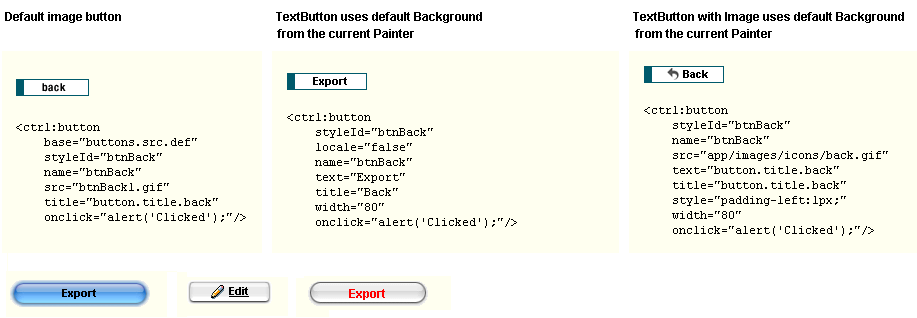
| src | String |
Specifies the name of the Image Resource with the button image.
Name convention:
The framework provides a mechanism for automatic image exchange
when certain mouse events take place. In order that the
mechanism can be used, the following rules apply:
- The name of the button (specified in the
name-attribute) must start with the prefix btn.
- The filename of the gif image used must have the following format: xxxxxxxN.gif. where <N> stands for the button state.
A distinction is made between the following button states:
- 1 = active (normal)
- 2 = inactive (disabled)
- 3 = hover (mouse over the button)
- 4 = pressed
| |
|
| style | String |
An HTML-style can be directly specified with this attribute.
Annotation:
See HTML documentation for the attribute style.
| |
|
| styleClass | String |
The HTML-class attribute of the element can be specified with this attribute.
Annotation:
See HTML documentation for the attribute class.
| |
|
| styleId | String |
The HTML-id attribute of the element can be specified with this attribute.
Annotation:
See HTML documentation for the Attribute id.
| |
|
| tabindex | Integer |
Tabulator Index for this element.
| |
|
target | String |
This attribute is used to set a HTML-target attribute.
Annotation:
See HTML documentation for the attribute target.
| |
|
| text | String |
The localized caption of the button. If this attribute
is specified the button is rendered as a text button.
| |
|
| title | String |
Is displayed in a Tooltip window when the user moves the mouse over the button.
| |
|
| tooltip | String |
A short descriptive text that is displayed when the user
moves the mouse over the element.
The character string is HTML-encoded before outputting.
| |
|
| width | String |
Sets the width of the control element. The height
may be specified in absolute or percent terms.
See the HTML documentation
| |
|